
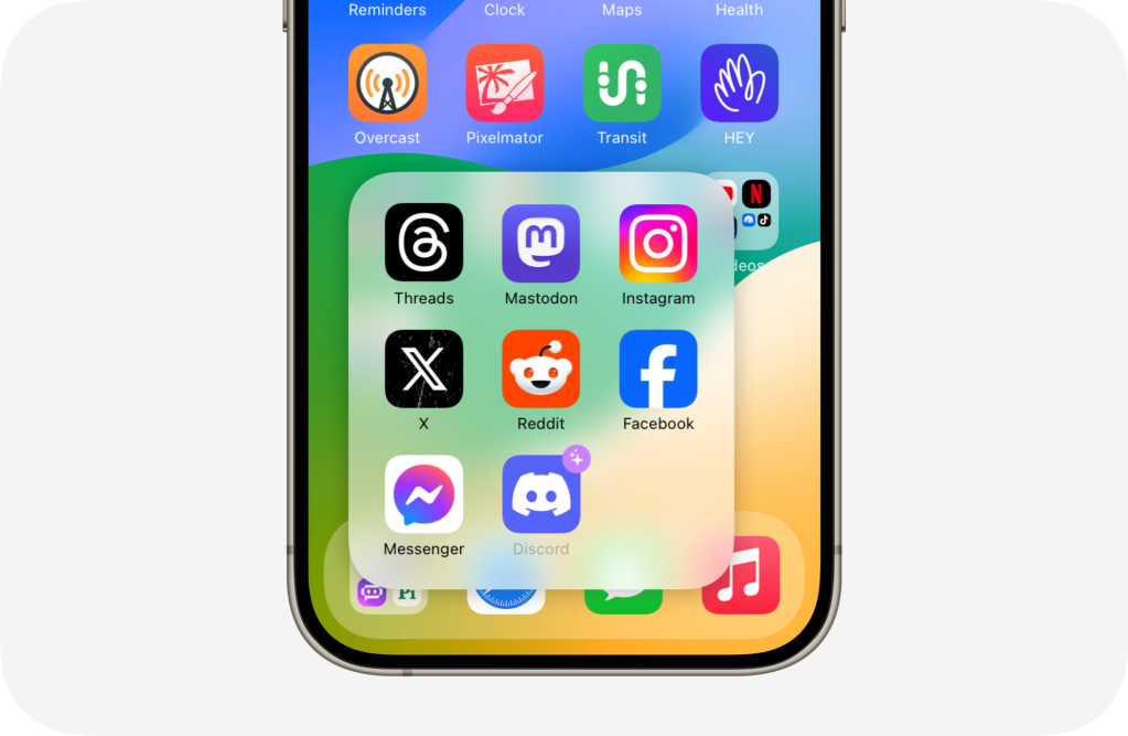
When Apple first introduced folders in iOS 4.0 they were extremely limited, but they were particularly innovative for the time. The folder icon showed a small 3 x 3 grid of the first 9 apps inside of a folder on a linen background with a metal outline. When tapped, they revealed a layer beneath your Home Screen wallpaper where these apps actually lived. Folders also intelligently named themselves using categories from the App Store that matched up with your assortment of apps. They were great for 2010. In 2013 folders got updated with a new design for iOS 7. They could hold way more apps and were paginated for the first time with each showing a maximum of 9 apps. It essentially tried to make you think you were zooming in on the folder icon. It was really cool. But folders on iOS have remained the same since then and it’s far past time for a major revamp.
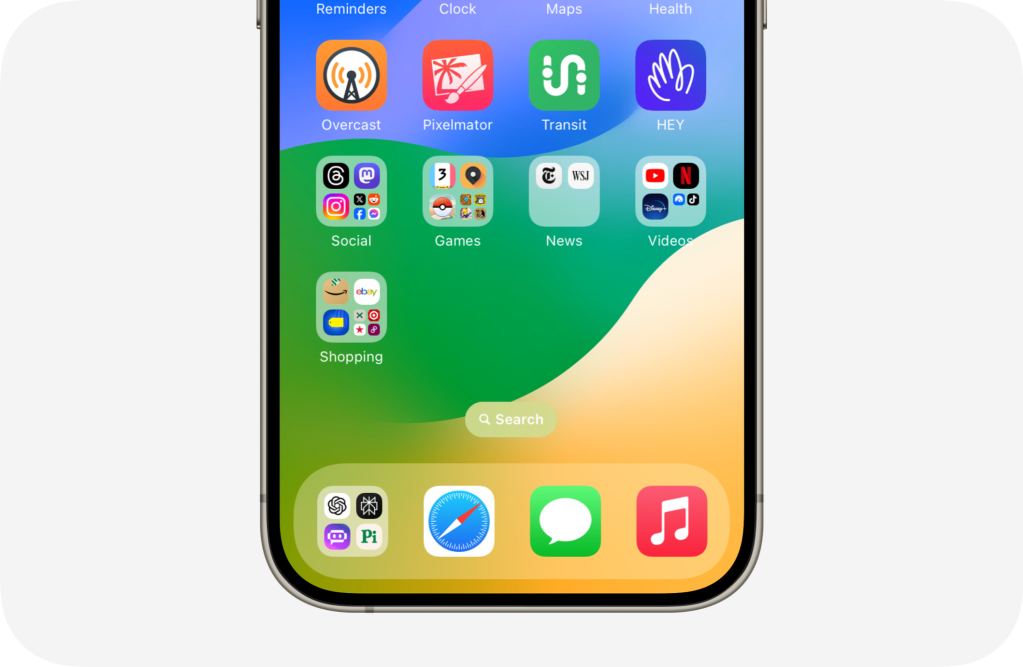
It starts with the folder icons themselves. When a folder has less than 9 apps, it still shrinks down icons to the same small size. If you place two icons in a folder, they are small and aligned to the top left corner rather than maximizing the space. To make matters worse, tapping a folder opens it in the center of the display and fullscreen. They waste space showing you only 9 apps at a time with plenty of real estate to spare. So what can we do about this? I looked to the App Library for inspiration here. App Library categories show three large icons and four smaller ones to denote that there’s more inside. Why not use the same look for folders? When a folder surpasses four apps, it should turn the fourth place into a 4 x 4 grid of even smaller icons. This way you can easily see the primary apps in a folder and when there are four or fewer you get larger icons that take better advantage of the real estate provided to them.
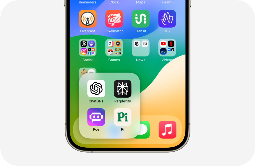
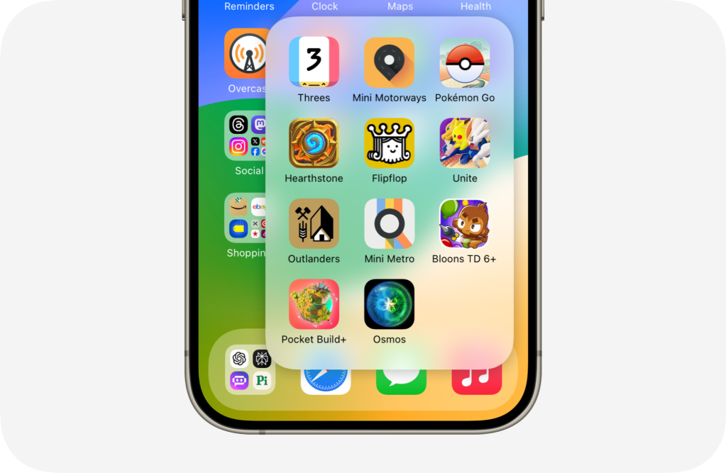
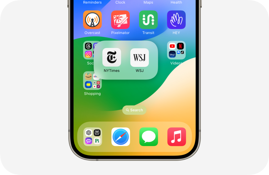
So we’ve fixed the design of folder icons, how can we make them maximize screen real estate better and bring them closer to their original touch target? Well instead of showing the full squircle in the center of the display, it could expand out of its icon in place making them more reachable. Plus, because they are no longer bound to the square shape they can change size depending on how many apps are inside the folder. (If a folder got so big that it could no longer fit all of your apps on the screen at once, it could simply start scrolling vertically like App Library categories) You also no longer need large folder names at all times since you aren’t taken out of your current context. You can see a few examples below:
Another feature that could vastly improve the folder experience is Siri suggestions. Siri already suggests apps using Home Screen widgets, in spotlight, and in other places throughout the system. What if Siri could help you add apps to folders that you use at similar moments or ones that fall into the same category? This builds upon the automatic naming feature introduced more than a decade ago.
Inside of a new editor interface, you could enable these suggestions or tap to add an app from the App Library. This would speed up folder creation quite a bit.

When suggestions are enabled, you would see additional apps appear in that folder. Like the Siri suggestions widget, the label would be greyed out but the app would still be launch-able. There could also be a small icon to help make it even clearer to the user that this is in fact a suggestion from the system and not an app that they accidentally placed in the folder. And from the editing interface, you could choose to save that app permanently to the folder.
Now there’s one more feature that I have wanted Apple to bring to folders since they introduced 3D Touch in 2015 and it’s related to Home Screen context menus.

When an app currently gets a notification inside of a folder, you can tap and hold the folder and quickly launch the app with the notification from the context menu. This should work at all times. Not just when apps have notifications. The gesture of tapping and holding, then sliding your finger to launch an app is very handy. So enable the ability to launch apps from outside of its folder without this requirement.
So there you have it! iOS folders are extremely useful, especially for folks like me who have a gazillion apps installed on their phones and after 10 years, it’s time for Apple to overhaul the experience.
